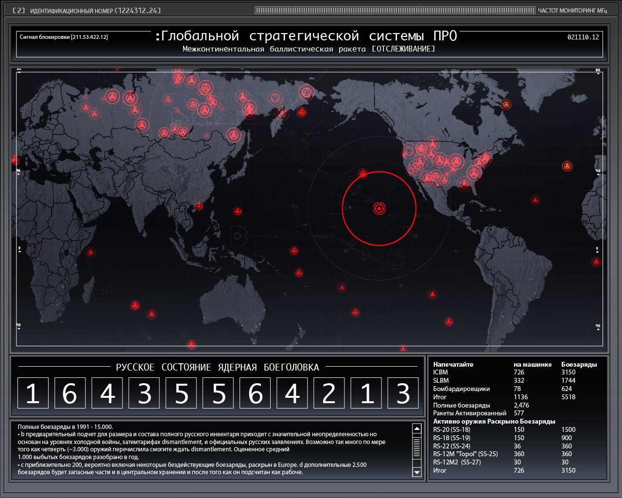
Mission Impossible: Ghost Protocol
2011
Director Brad Bird
Studio Paramount Pictures
Plot Agent Ethan Hunt and his elite team go underground after a bombing implicates them as terrorists. While trying to clear their name, the team uncovers a plot to start a nuclear war.
Employer OOOii
Role Lead Designer and Animator
I designed and animated every one of the User Interfaces seen in the film.
Tools
Adobe Photoshop, Illustrator, and After Effects. No 3d elements were created, only 2.5d using After Effects.
IMF User Interface Design and Animation
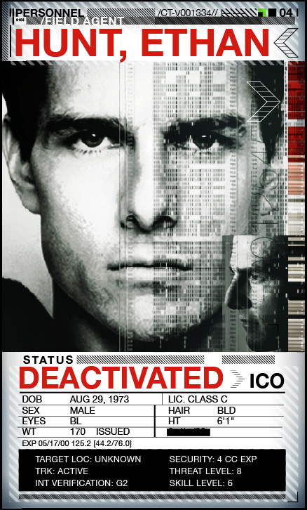
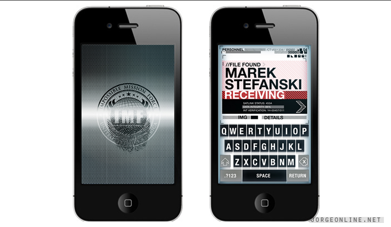
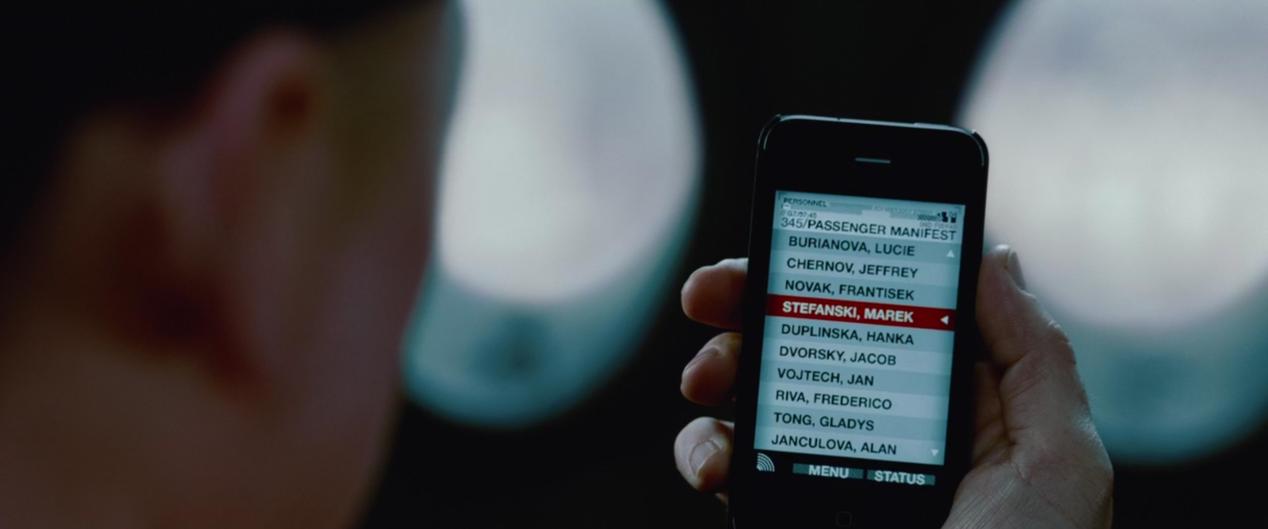
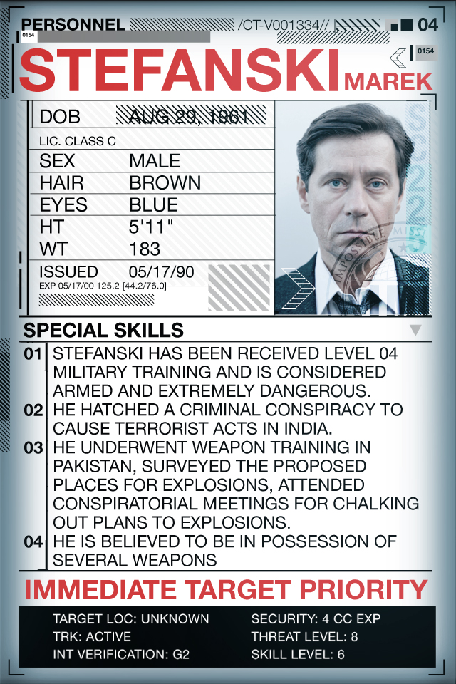
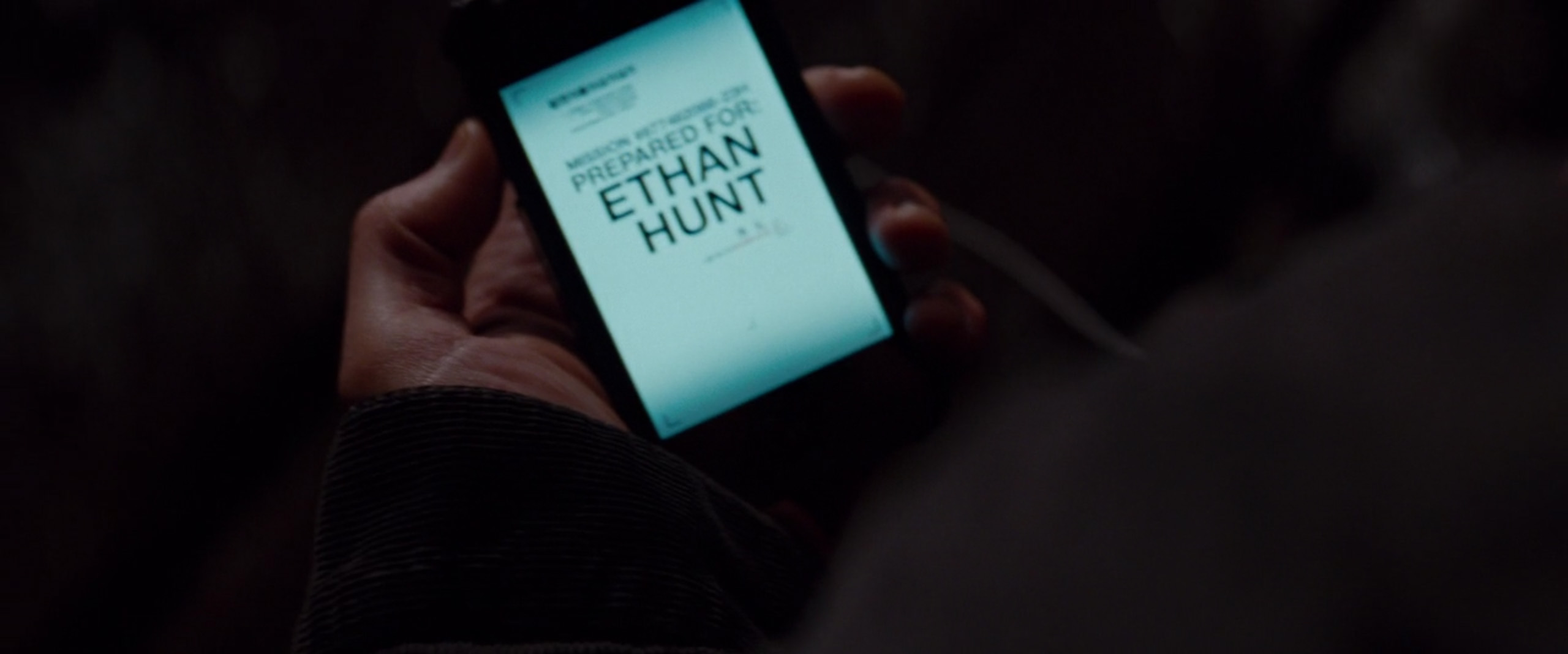
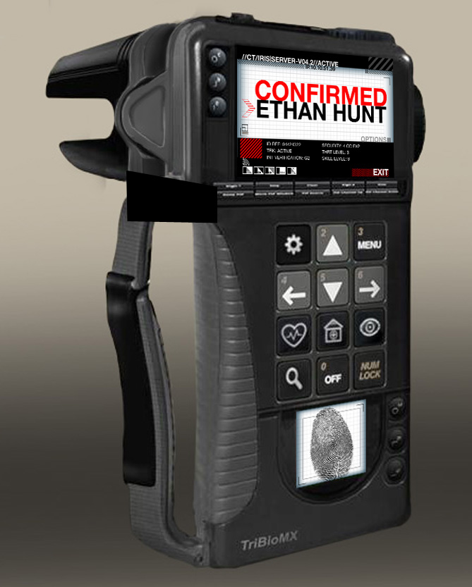
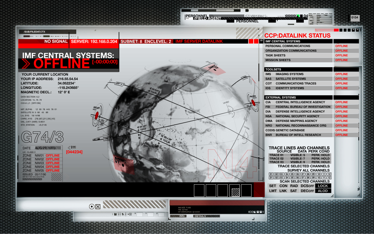
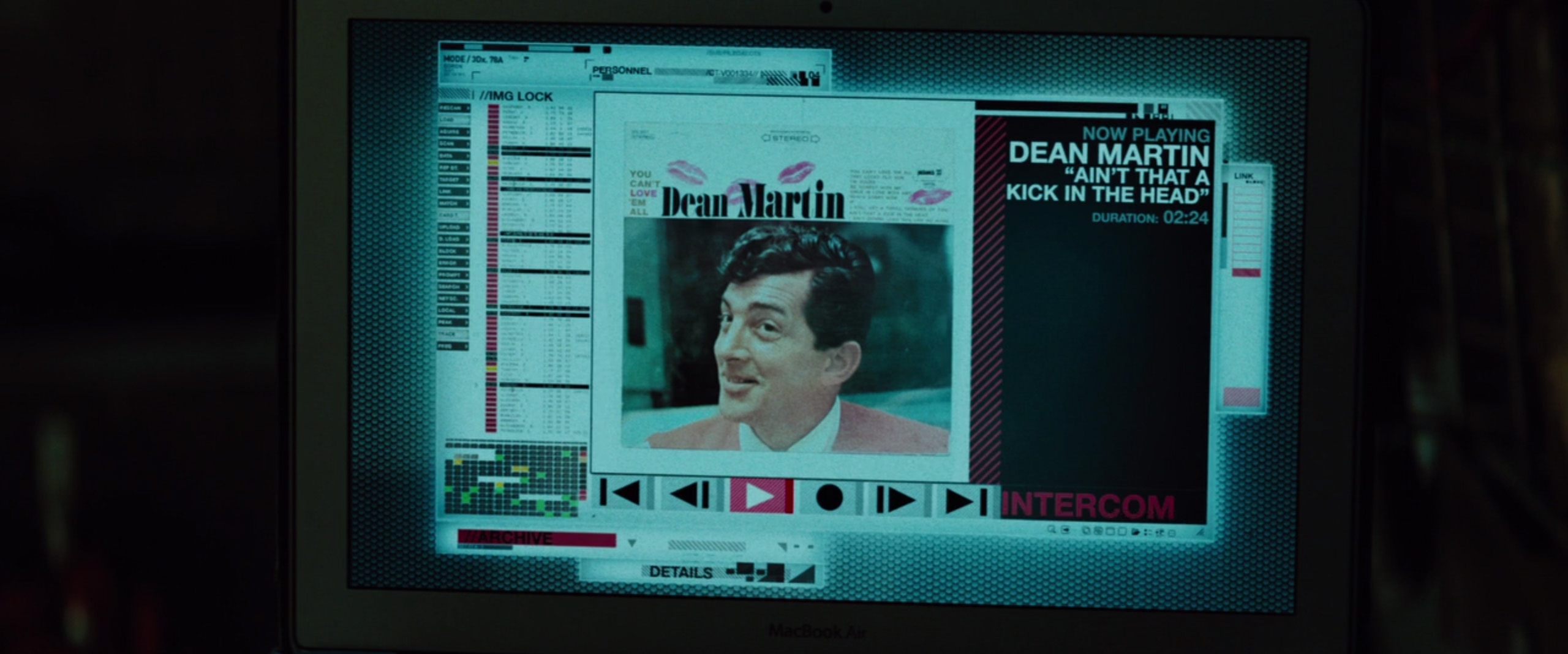
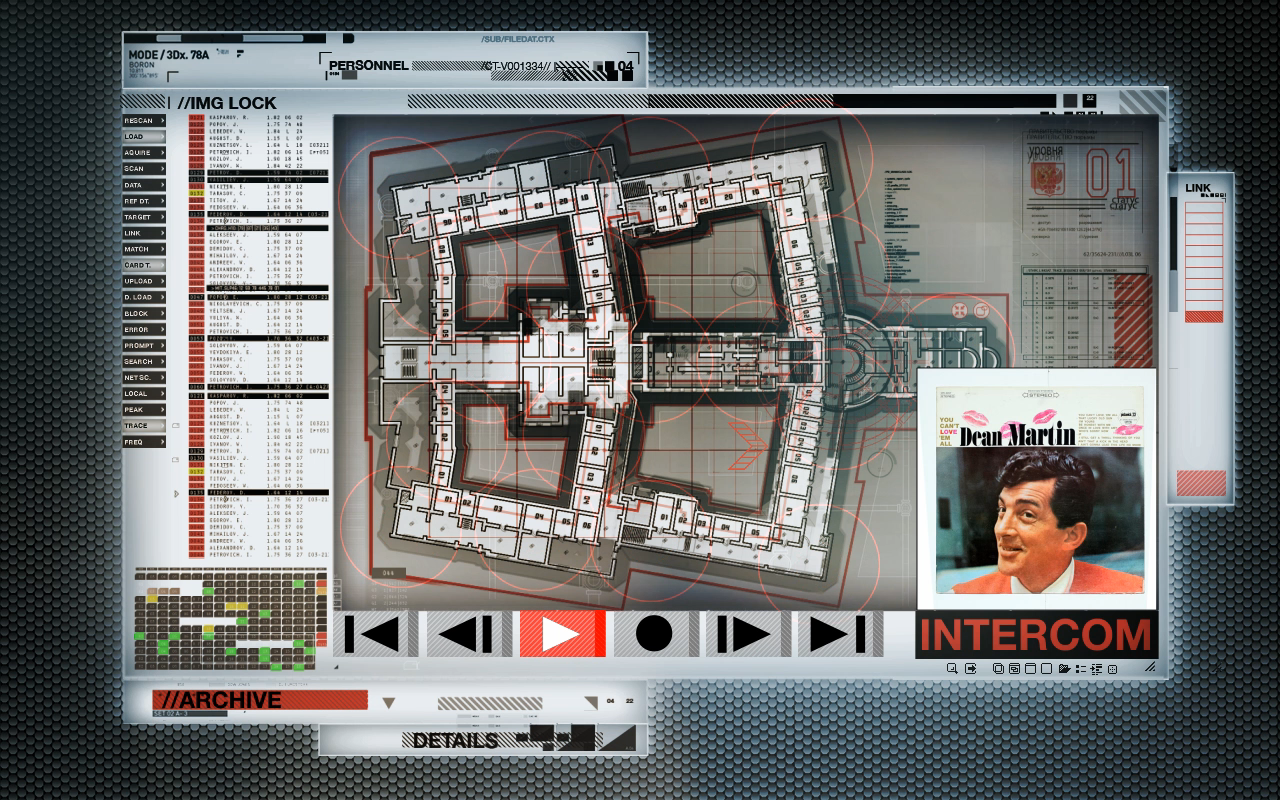
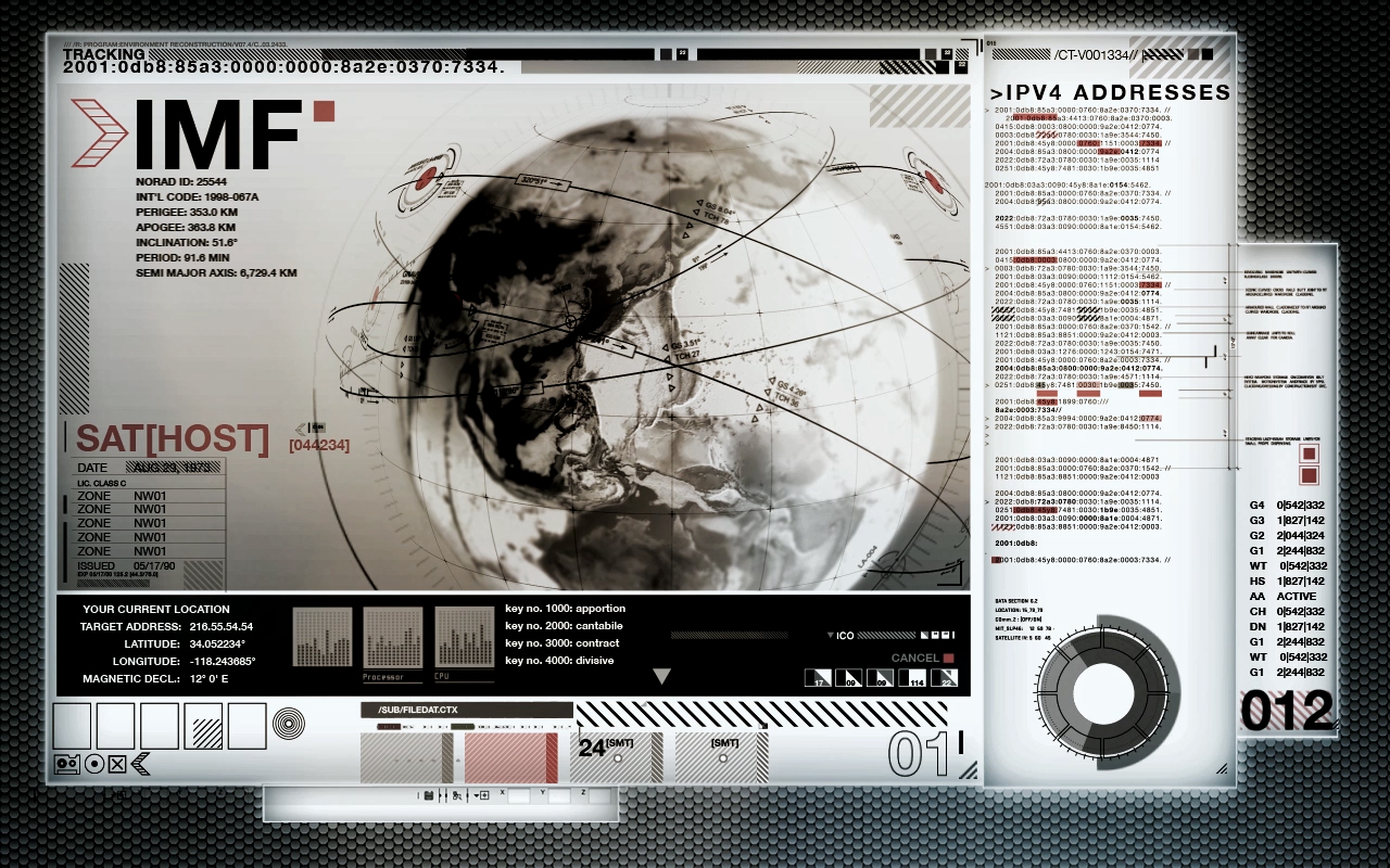
One of my first tasks was to design the user interface for the Impossible Mission Force (IMF). I wasn’t given any creative direction, which freed me to try something different from the previous films. I had seen a conceptual design of the traincar safe-house. It had a retro-futuristic metallic design, which I used as a conceptual starting point. I tried to design something that I felt would fit within that world. Metalic, monochromatic, functional. I also wanted to suggest a feeling of secrecy, almost as if the agent is using a flashlight to view the information. This led me to play around with adding a vignette around the edges of the design- giving it the suggestion of a physical reality. The interface windows were stylized to feel like the light boxes that doctors use to view X-rays.I also tried to give it a utilitarian, government agency feel. I worked off of the idea that an agent would need information as efficiently and clearly as possible- almost like a powerpoint presentation. Not only so that the agent could quickly analyze crucial data, but also to reduce overall file size. It also provided me with a justification for using oversized text for crucial story points.




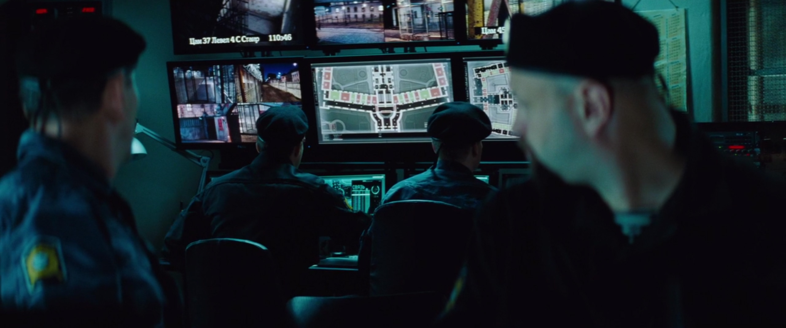
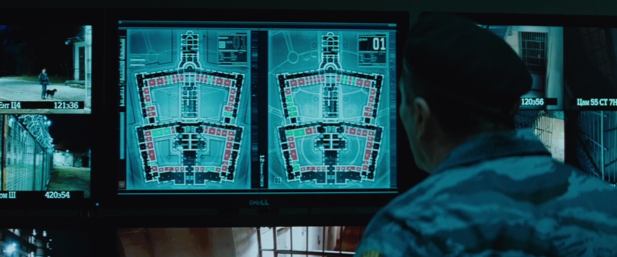
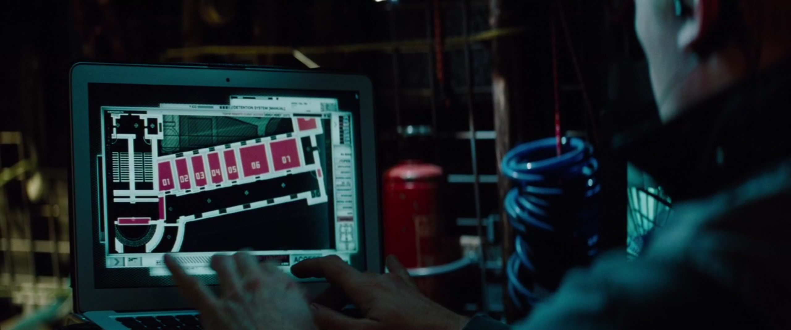
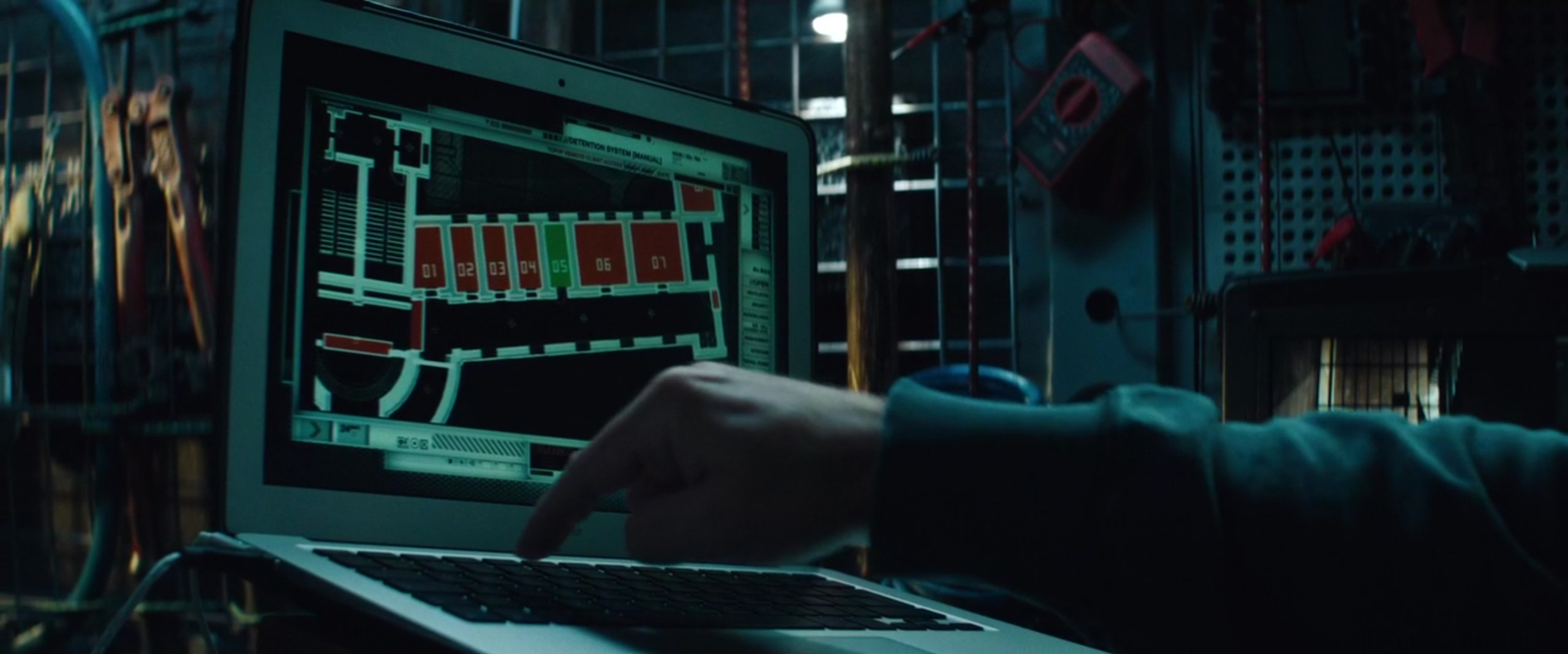
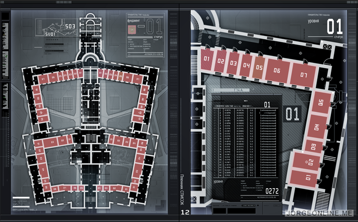
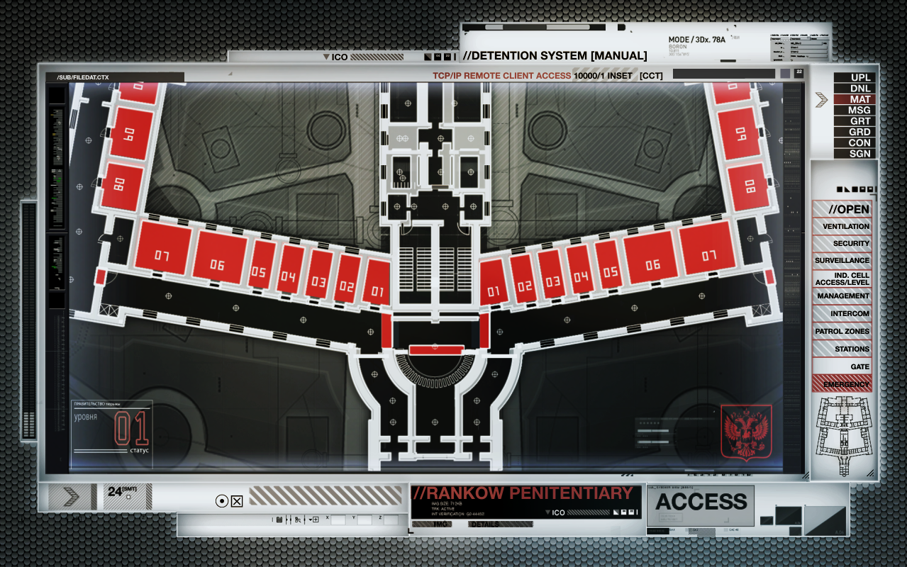
Rankow Prison User Interface Design and Animation
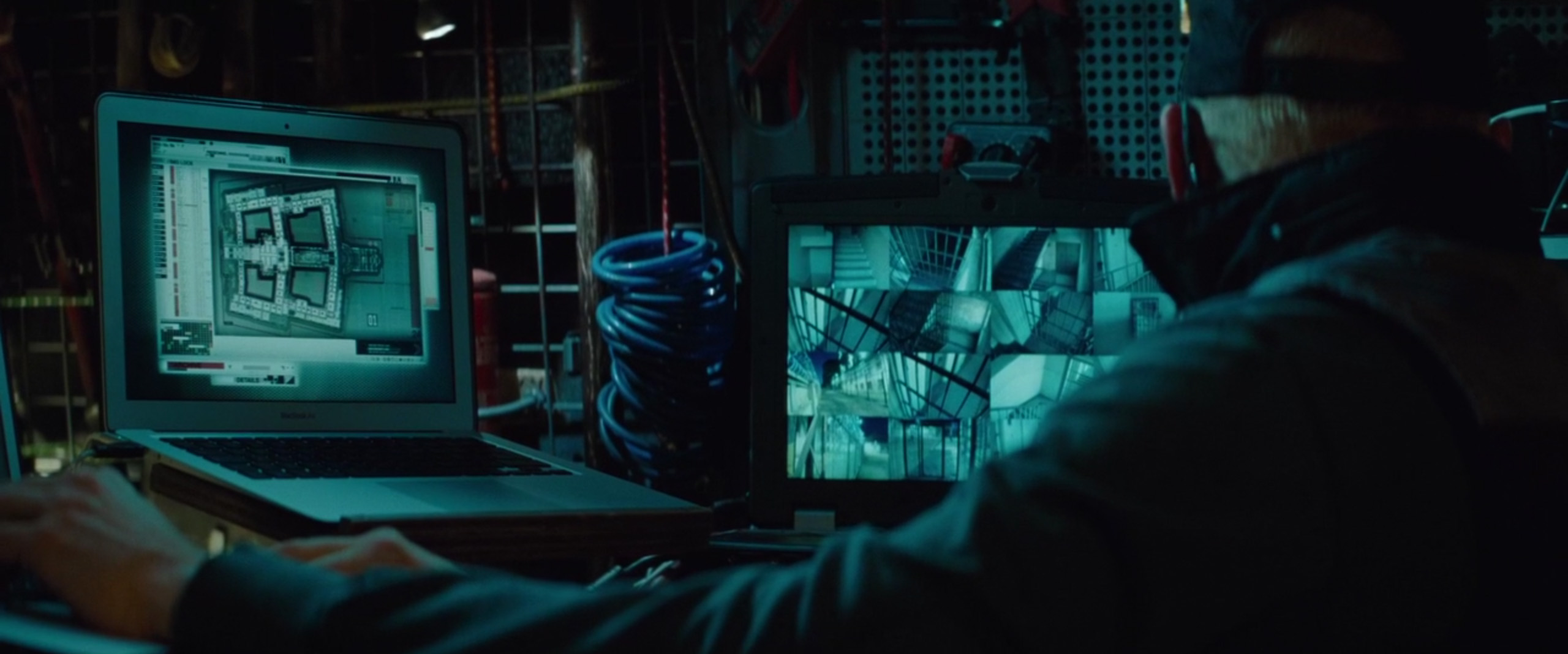
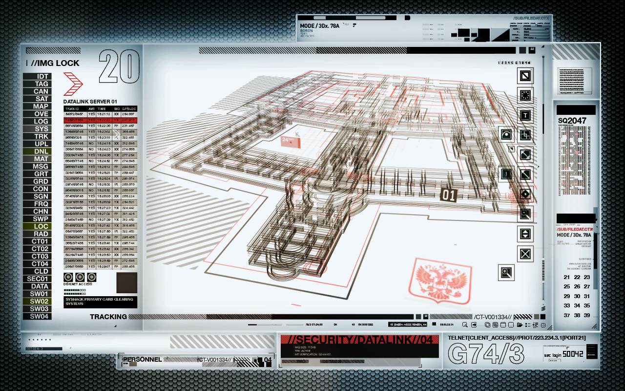
The first scene in the movie and the first time we see the IMF interface. Benji is sitting in a van with multiple monitors. He has hacked into a Russian prison security system in order to free Ethan from one of the cells.I tried to make the prison layout a cross between 3d model and blueprint. I wanted it the graphics to feel aged without feeling dated.All of these interface animations were built to play on set during production.

Phone Booth Mission Video Design and Animation
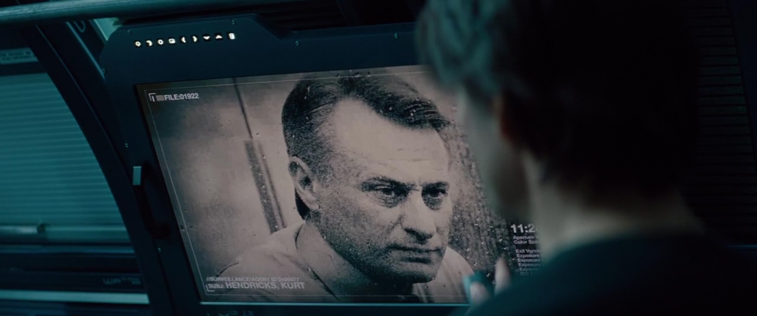
This interface was for the classic “Mission Impossible” scene where Ethan receives his mission via a top secret video. For this film, the video is viewed on a practical video monitor hidden within in a phone booth.Production gave me an audio recording of the mission for timing, as well as fake surveillance photos and satellite imagery. They pretty much left it up to me to fill in the rest. Computer graphics can be cold and soulless, so I wanted to make the data physical and real. I incorporated photographic elements into the UI by creating a series of fake top-secret documents complete with redacted lines of text and “TOP SECRET” stamps. In order to age them, I used Photoshop to add burnt and scuffed paper textures. I wanted to give the documentsa history, as if IMF field agents took tremendous risks in retrieving them.
For the animation, I thought it would be cool to make it feel like the classic slide projector briefings seen in spy movies, but with a layer of digital tech.
The final animation played on set during production.
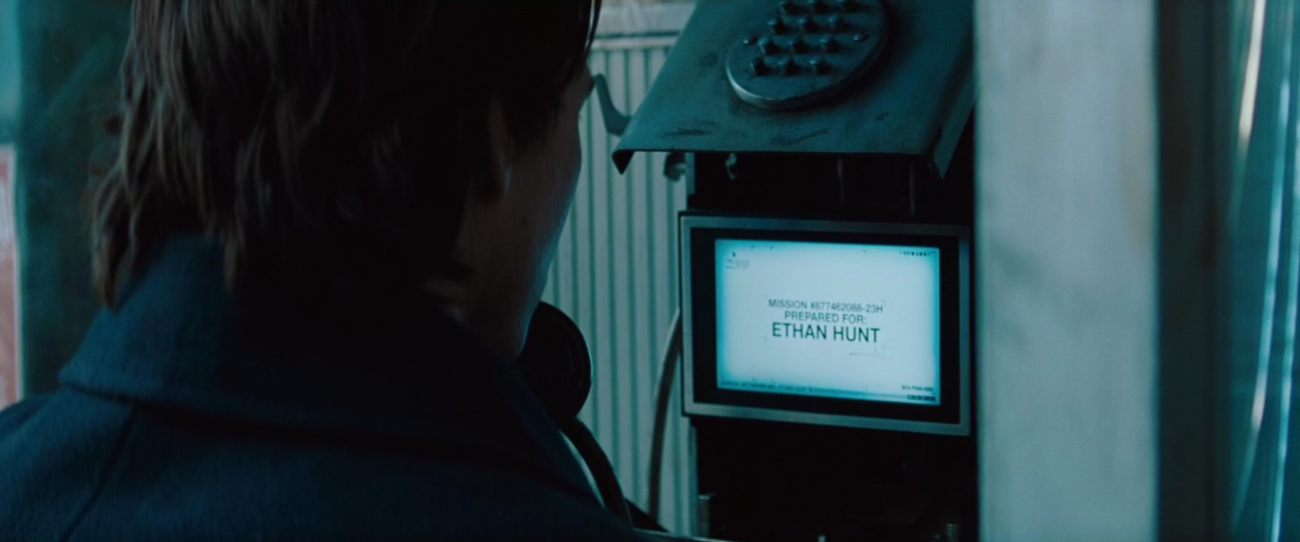

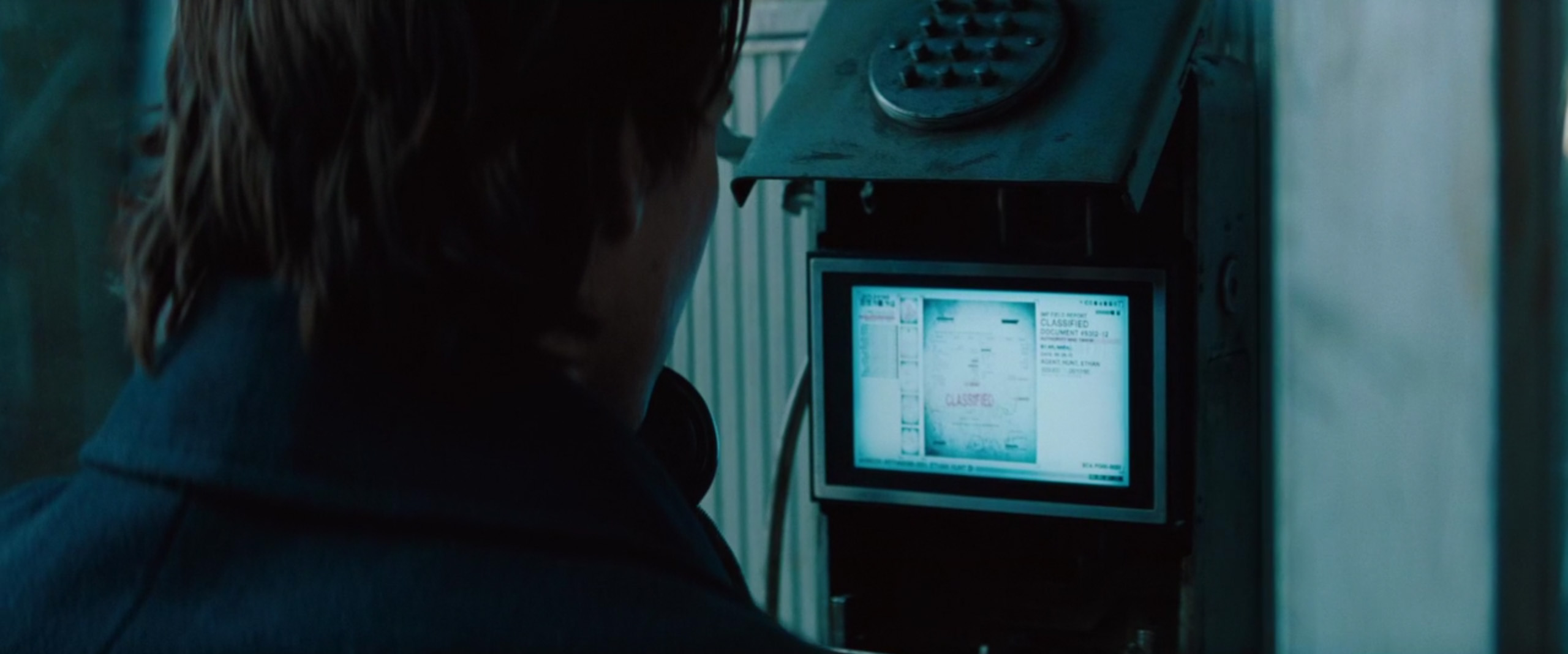

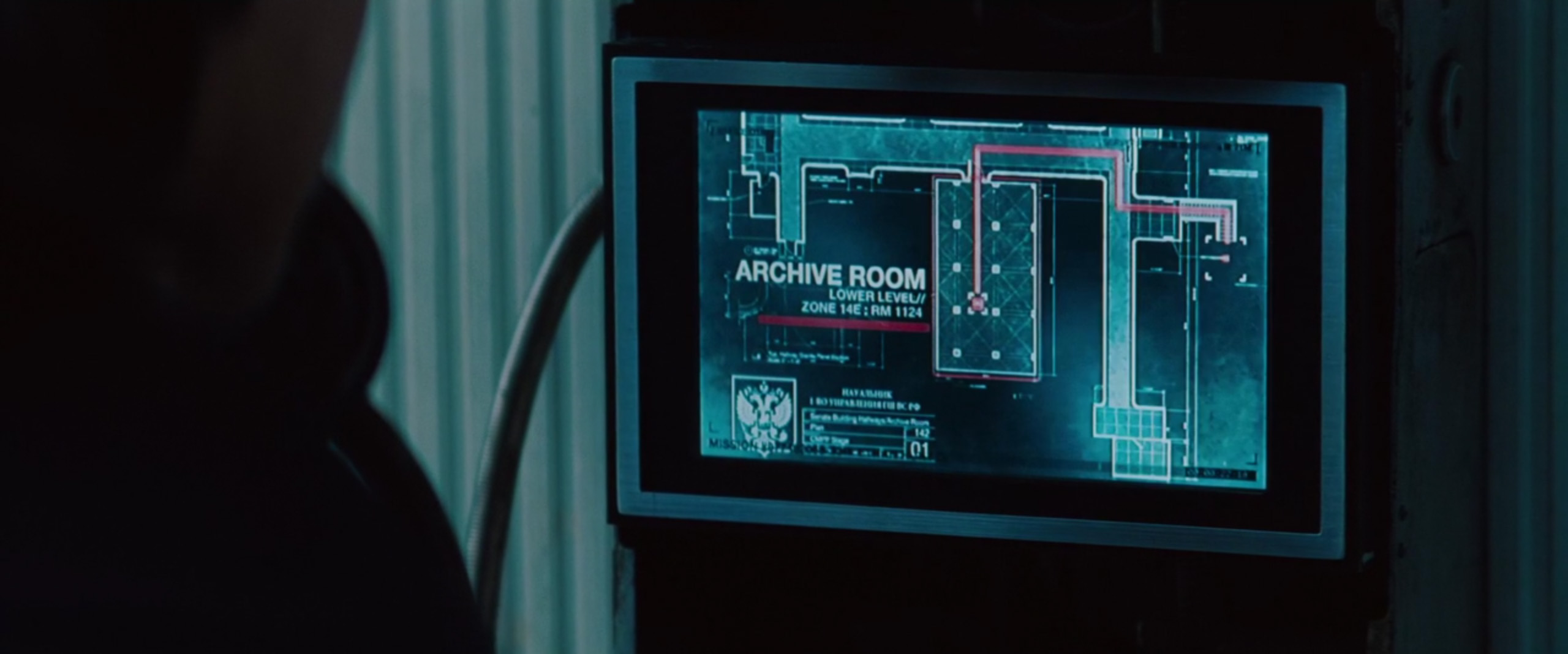

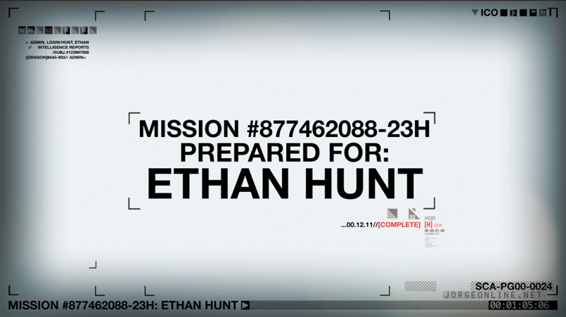
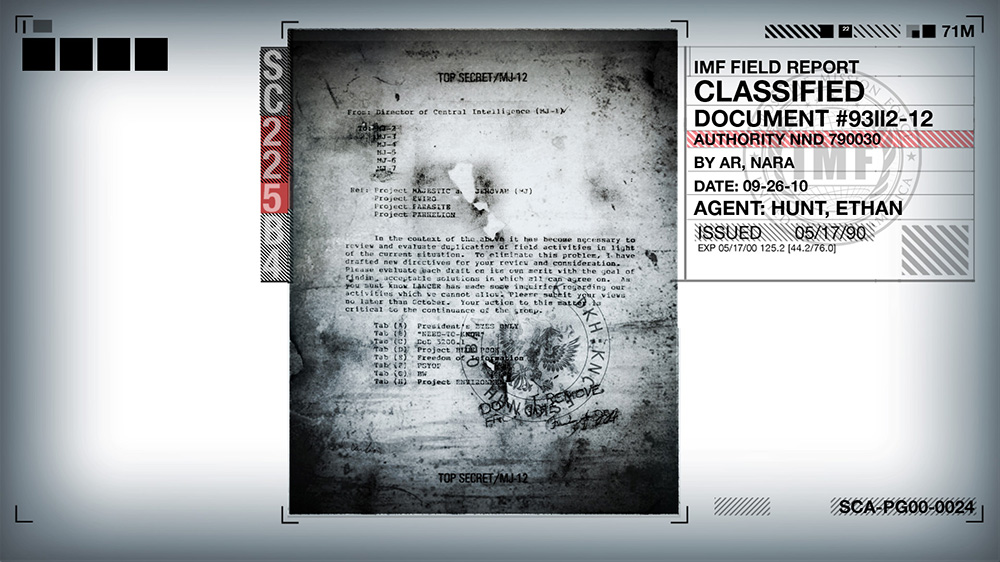
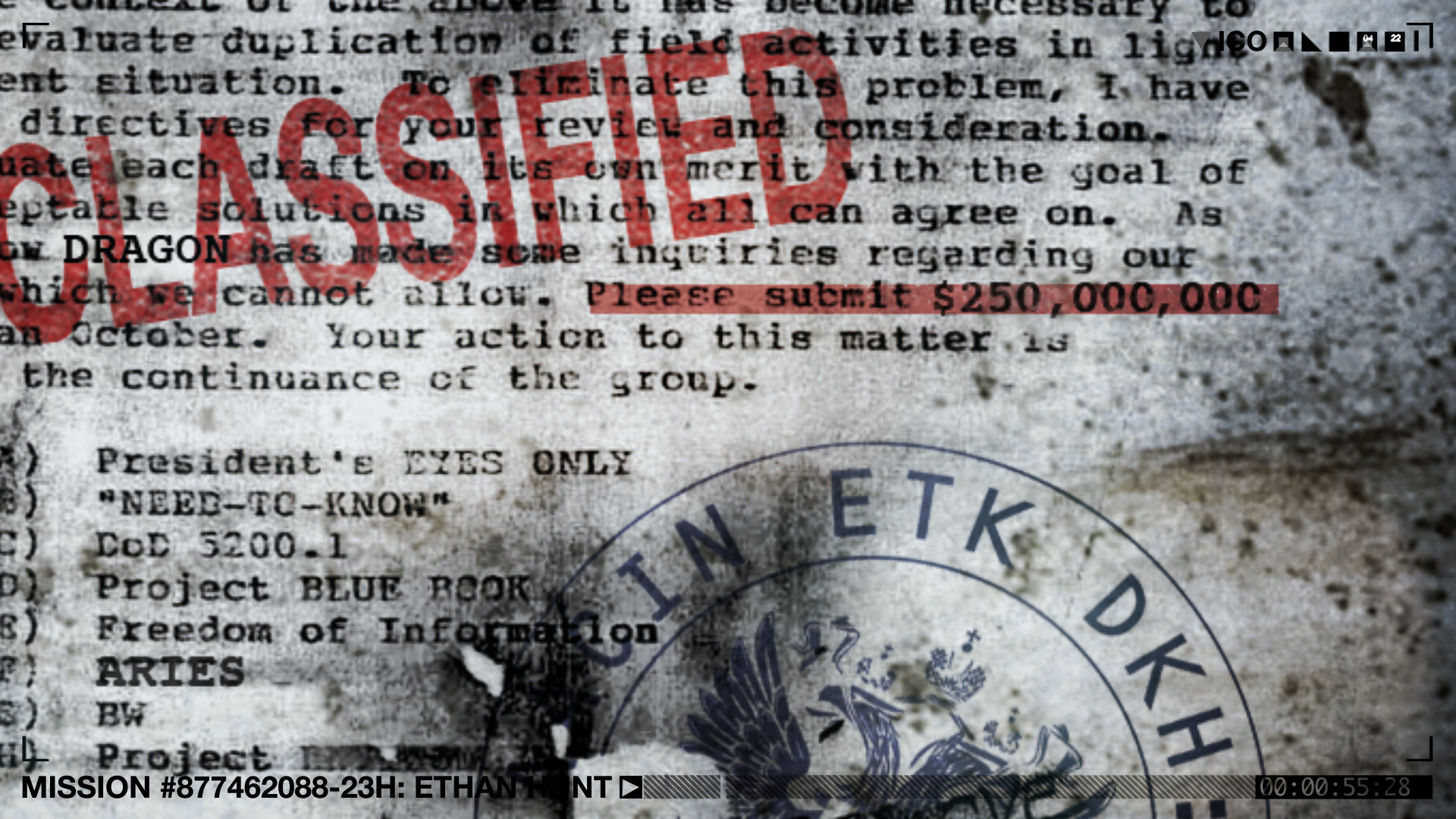

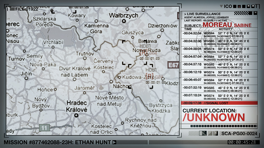

Here is the actual video I created with early temp audio. I was told we would be replacing it in post so the middle section is pretty rough, however they liked it enough that they ended up keeping it....
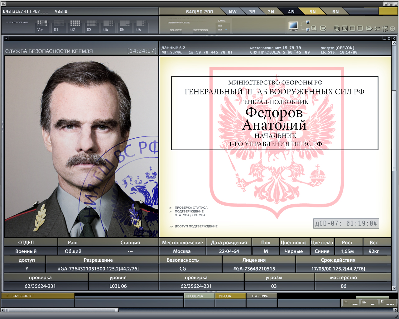
The Kremlin Hallway Scan User Interface Design and Animation
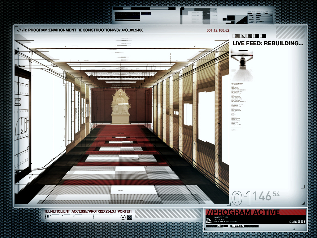
The Kremlin Hallway was one of many concept-driven animations I did for MI:4, where the purpose is to visually explain what the computer is doing. In this case, I was showing the Kremlin hallway being scanned and transformed into a duplicate 3D environment. These can be tricky to pull off, because I wanted it to look visually interesting without feeling cartoony. The whole thing was animated in After Effects, using 2D elements placed in 3D space. Gladys took a series of set photos, which I then used to trace elements (like the statue) in illustrator and create fake texture maps. I like this approach, because I find I can get some pretty cool results that feel different than traditional 3D.
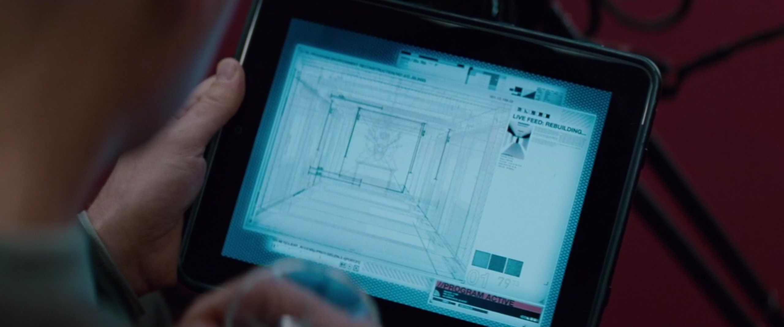
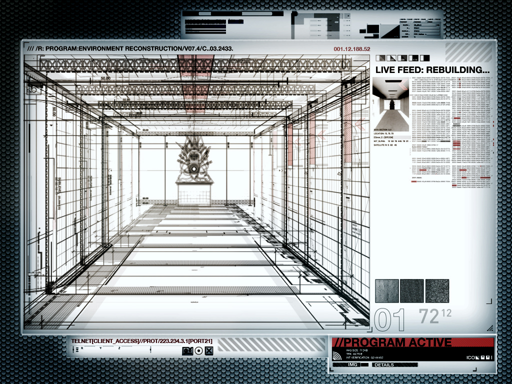
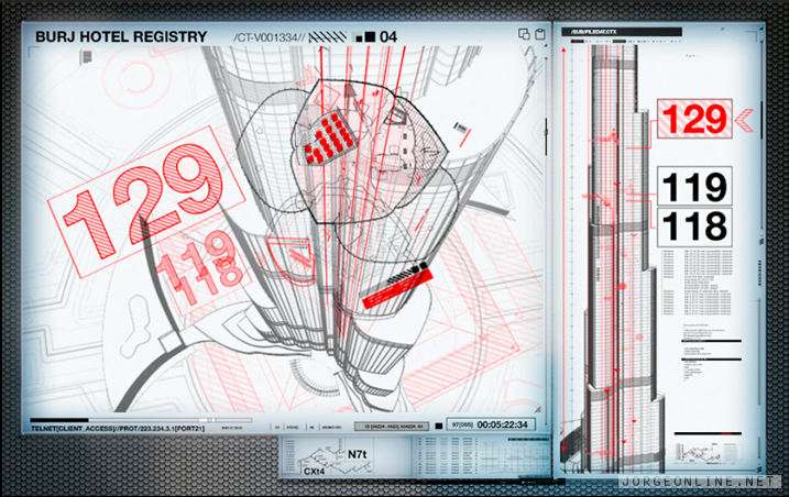
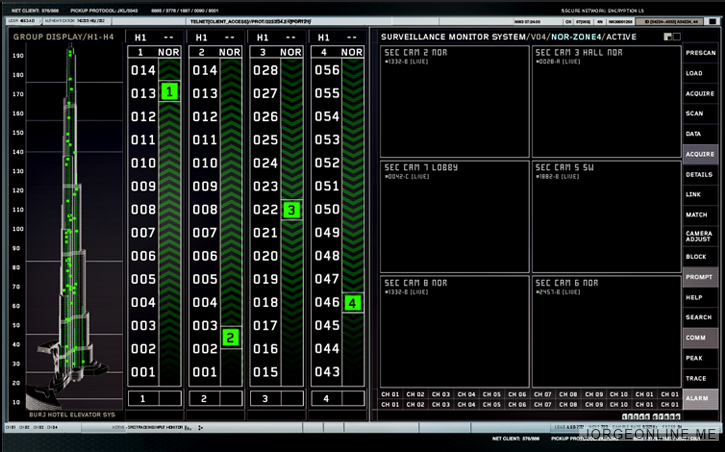
The BURJ Hotel User Interface Design and Animation
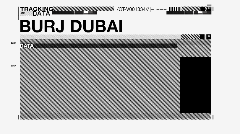
Benji hacks into the hotel registration and elevator control system.
![]()


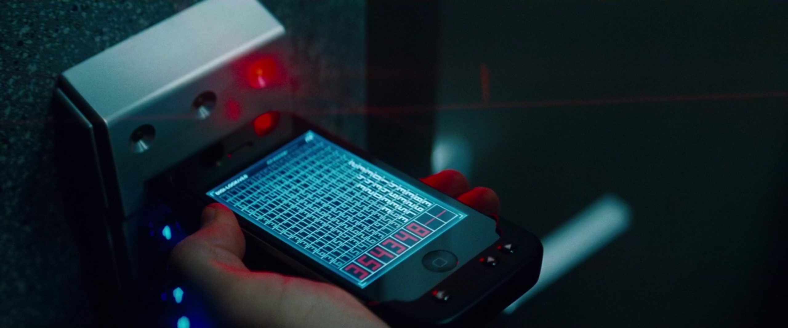
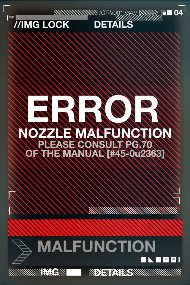
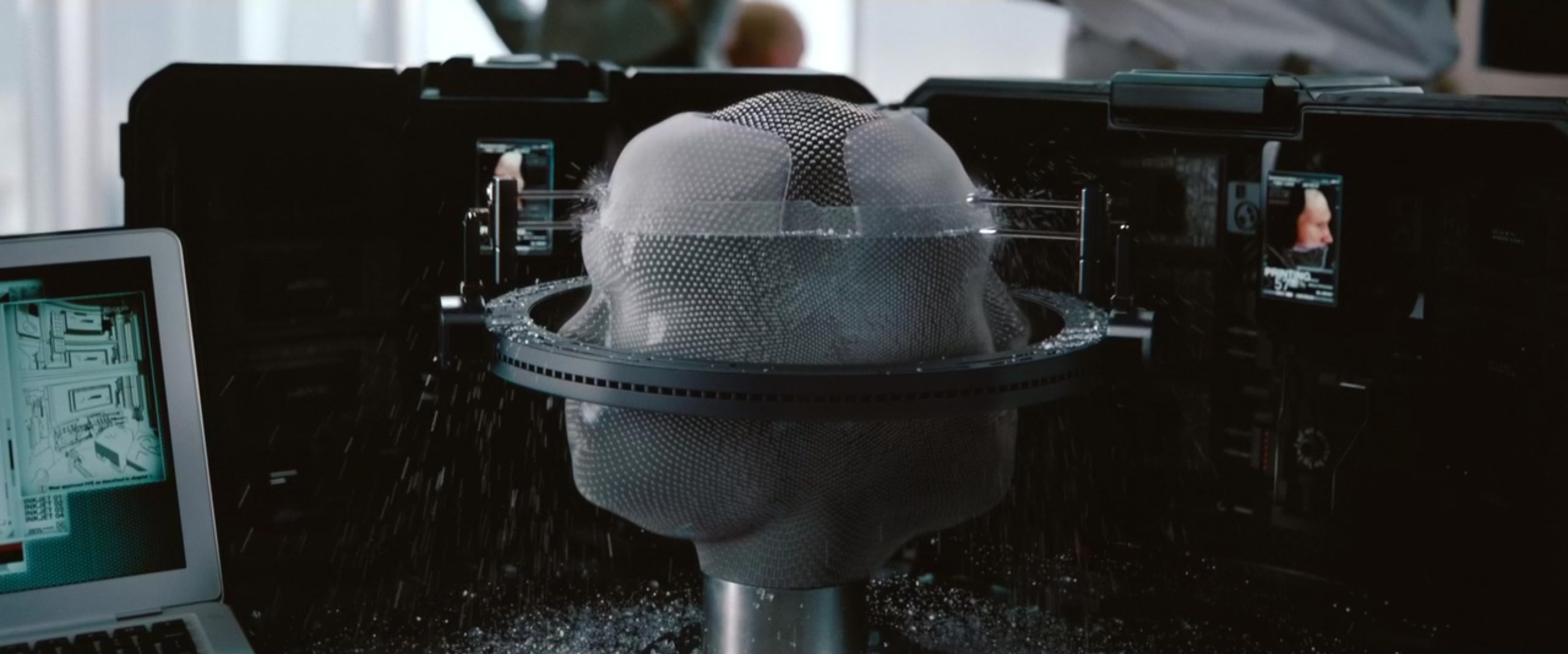
Dual Maskmaker Interface Design and Animation
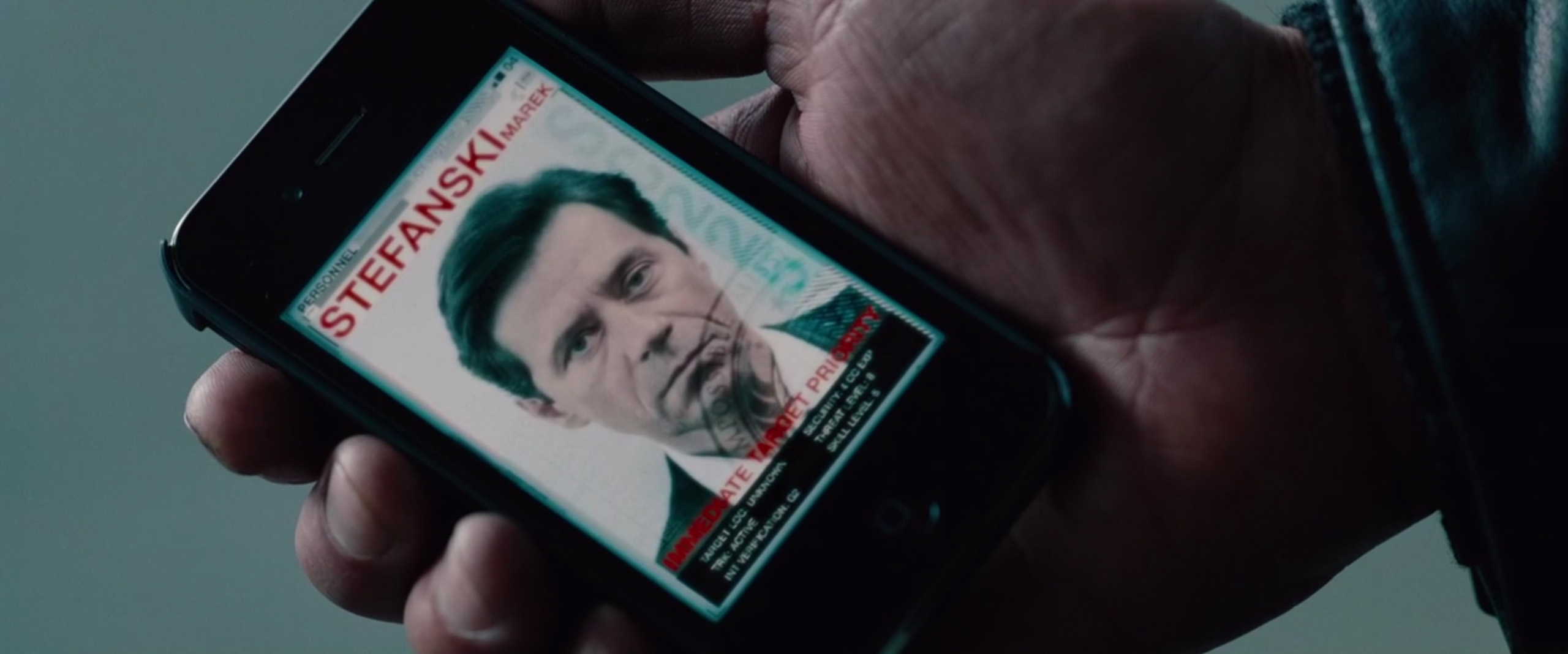
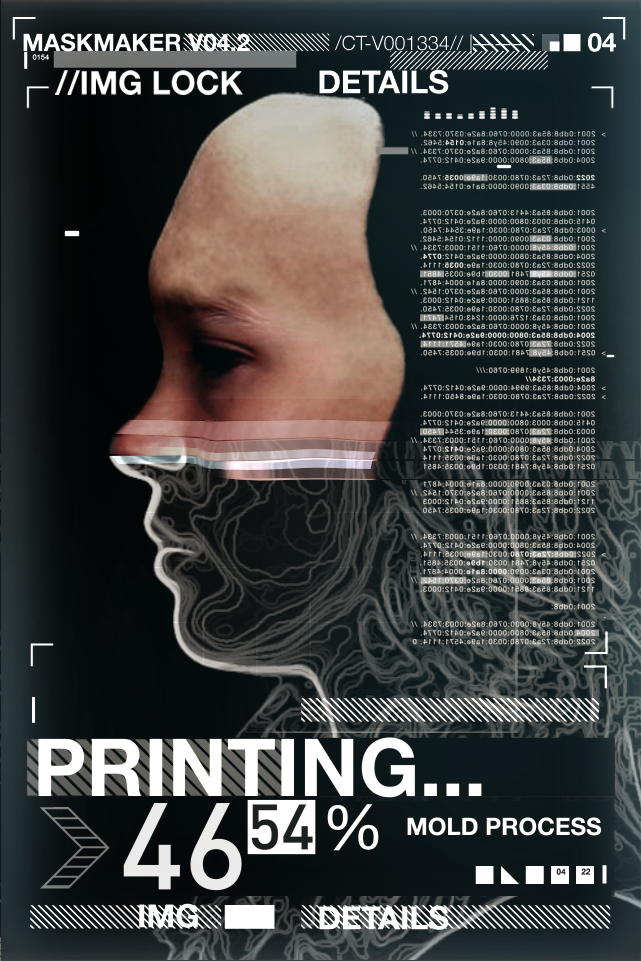
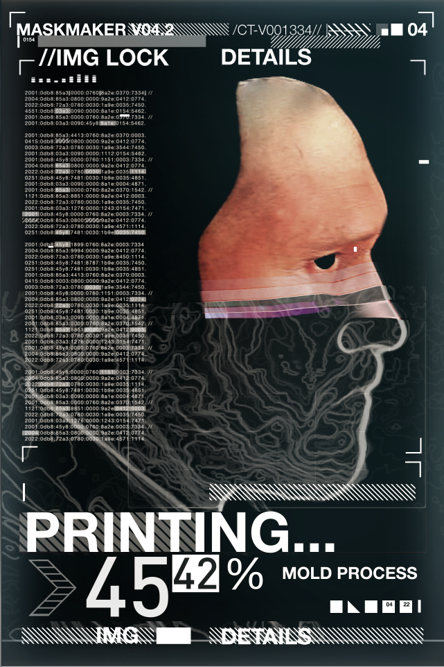
I had to crank this one out pretty quickly during production. I needed to create two animations that would play on Iphones. I was provided with a few photos of the actors and put something together using After Effects. I basically tried to mimick the movement of a traditional printer.

GPS Tracking Device Interface Design and Animation
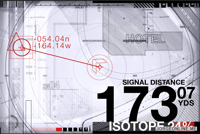
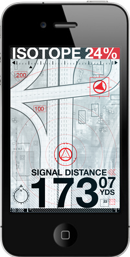
Originally, the graphic was going to include a degrading isotope indicator. Basically it was a countdown suggesting that Hunt had a limited time to locate the villain. This was later eliminated, leaving only the distance indicator. The final animations were created during post-production.
![]()


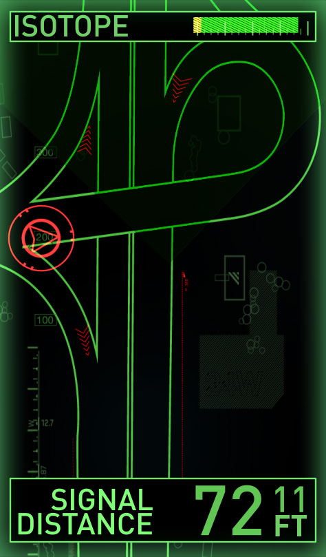

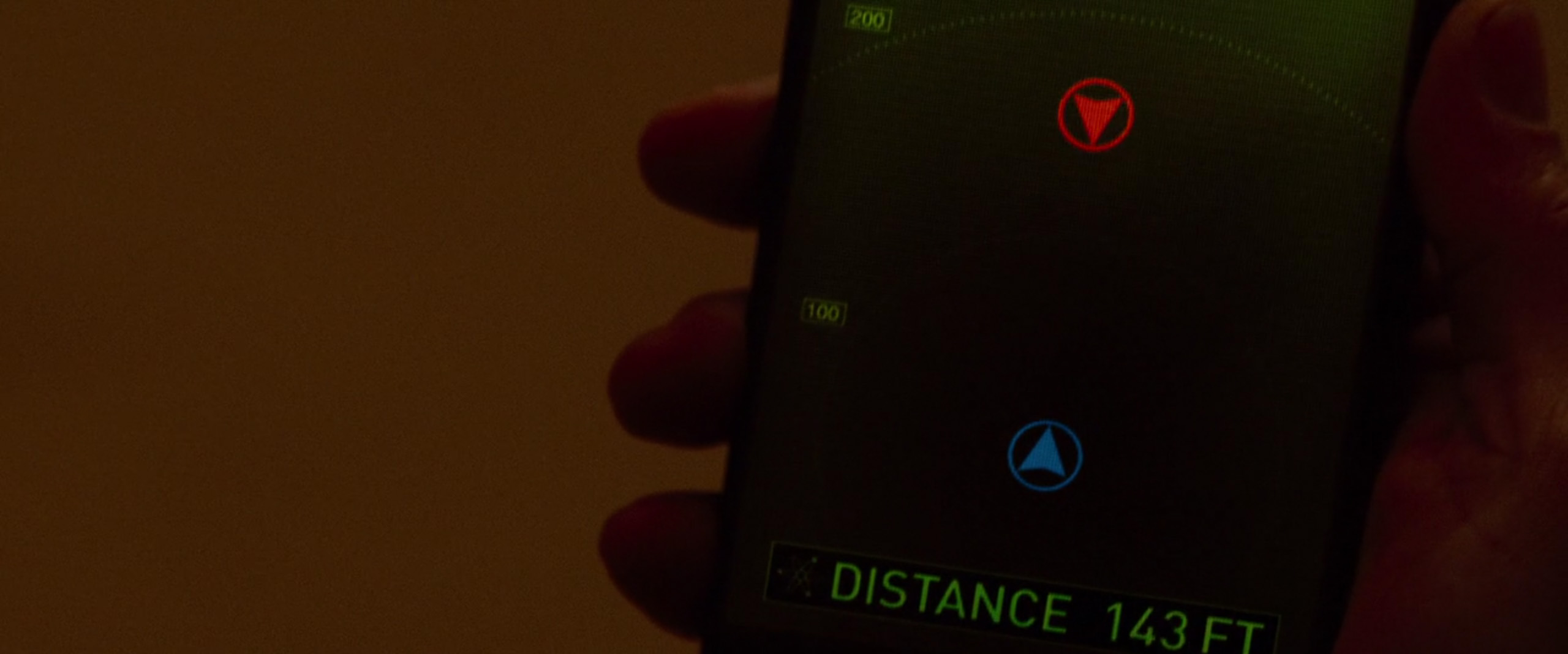


The scene in the film that features the GPS Interface...
IMF Traincar
I can’t take any credit for the design, as the majority of elements are based directly on concept art provided by BMW. I did create the map and other hero elements, but tried to keep the



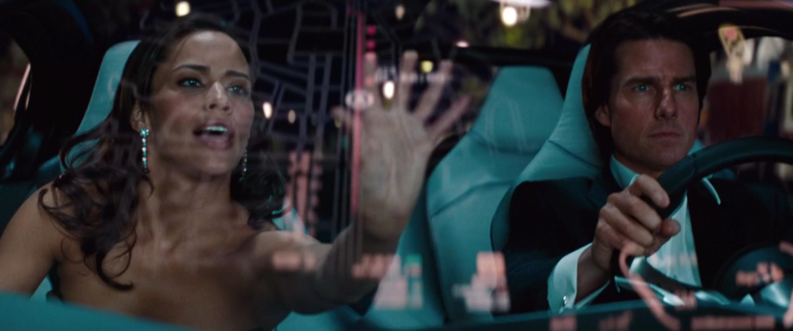
BMW Vision Windshield Display Interface Design and Animation
I can’t take credit for the basic design, as it was taken directly from concept art provided by BMW. I did create the map and other hero elements, but tried to keep them consistent with BMW’s design style. While I did not have any direct contact with BMW during the process, they did have final approval on the HUD animations. Fortunately, they were happy with everything I produced and approved the sequence without any changes.
![]()


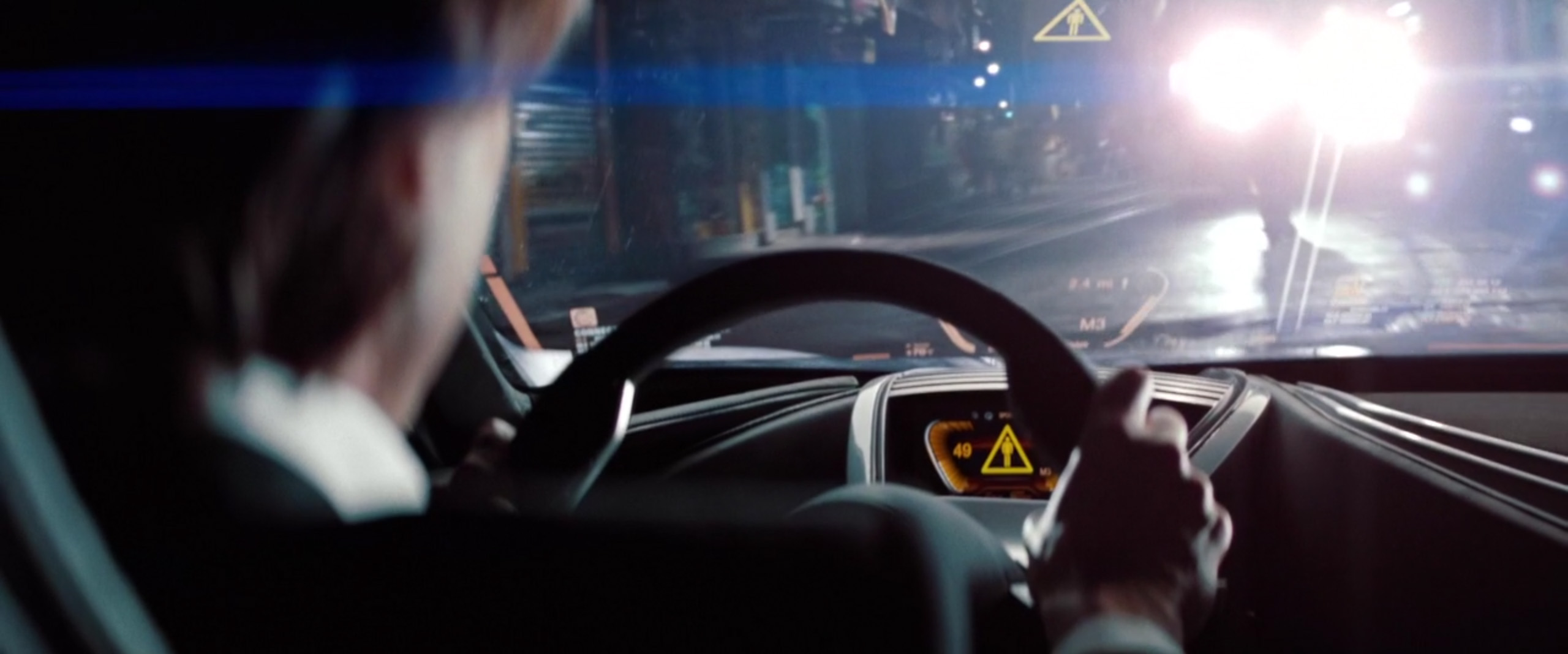

Test composite of HUD graphics overlayed on rough footage...
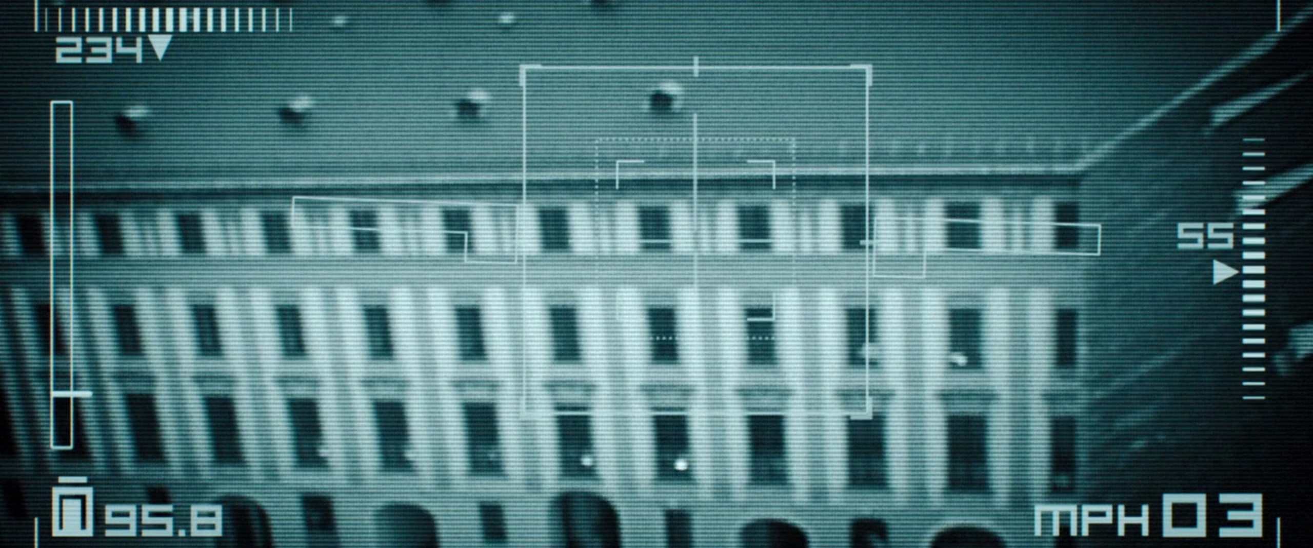
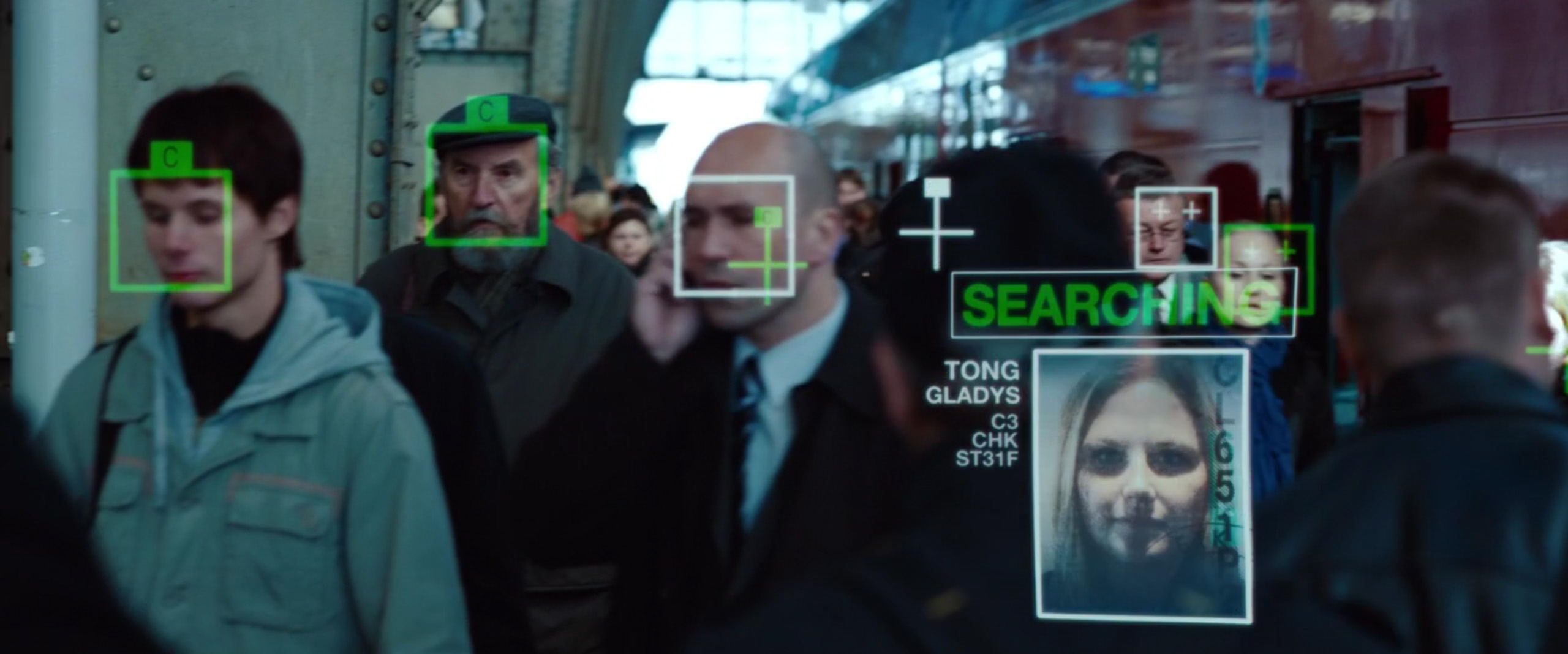
Facial Recognition Contact Lens Interface Design and Animation
Since this interface was being projected through the character’s contact lens, I thought it would be appropriate to keep the design very simple. In retrospect, I might have made it too simple, but it’s still effective.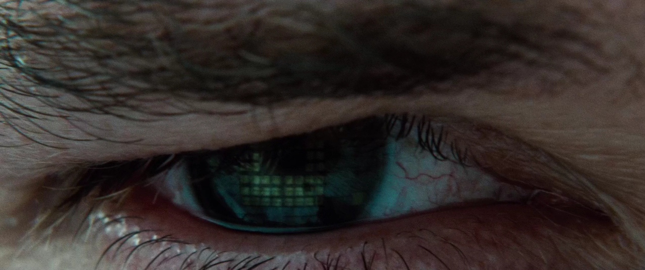


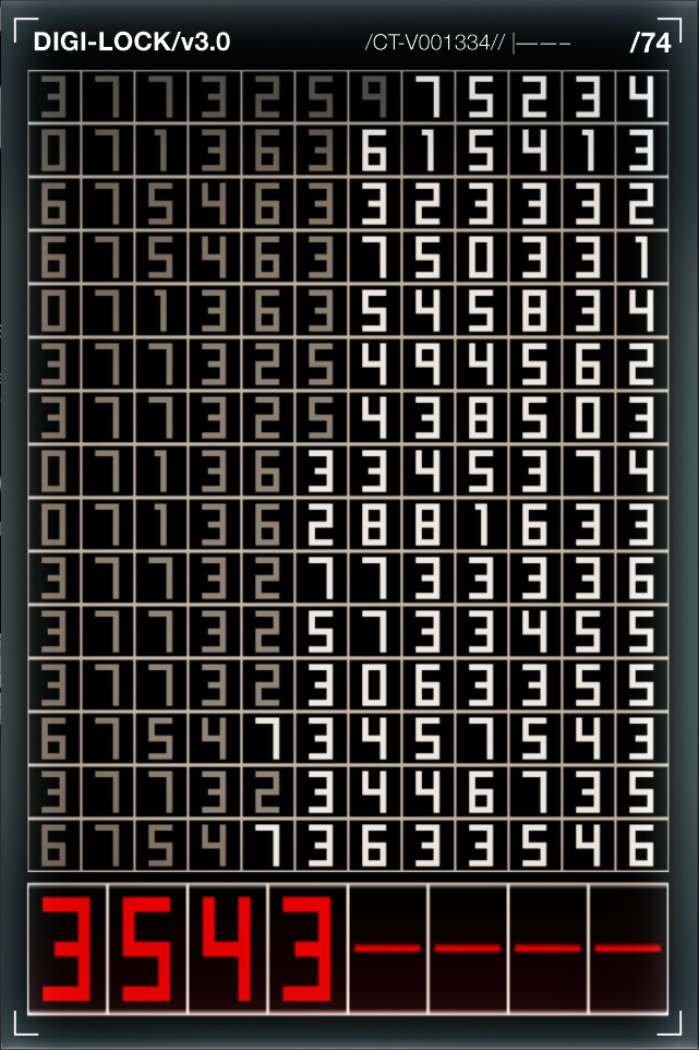
Hotel Door Room Number Replacement Interface Design and Animation


Other Interfaces Design and Animation
